It turns out that the internet’s obsession with Leon S. Kennedy wasn’t an accident. While fans have been thirsting over the rookie cop-turned-government agent for decades, the recent remake of Resident Evil 4 took things to a whole new level. In a surprising revelation that delighted fans everywhere, it has come to light that female Capcom staff had a mission to make Leon Kennedy as hot as possible during the development of the remake.
This wasn’t just a happy coincidence or a byproduct of better graphical fidelity. It was a deliberate creative choice. The 2023 remake didn’t just update the graphics; it refined the character’s essence, striking a balance between gritty survival horror grit and undeniable sex appeal. Let’s dive into how this “mission” unfolded, the specific changes made to Leon’s design, and why this approach matters in the modern gaming landscape.
The “Hunk” Agenda: Inside the Dev Diary
The news broke via translations of Capcom’s official dev diaries and art books, specifically highlighting the discussions between the character design team. According to reports, the female members of the staff took charge of Leon’s visual direction with a very specific goal: maximizing his appeal without sacrificing his badassery.
In the original 2004 title, Leon was certainly handsome, but his look was heavily influenced by mid-2000s fashion—think distinctively flared pants and that asymmetrical hair that defied gravity. He was cool, but he was also a product of his time. Fast forward to 2023, and the team knew they needed to ground him in reality while amping up the charm.
The mission wasn’t just about giving him a pretty face. It was about the “total package.” The team focused on the nuances of his expressions, the fit of his tactical gear, and even the way he moves. This internal push from female staff members ensured that Leon wasn’t just another generic action hero, but a character designed with a specific, appreciative audience in mind.
2005 vs. 2023: A Glow-Up for the Ages
To appreciate the effort put into the redesign, we have to look at the contrast between the original and the remake.
The Hair
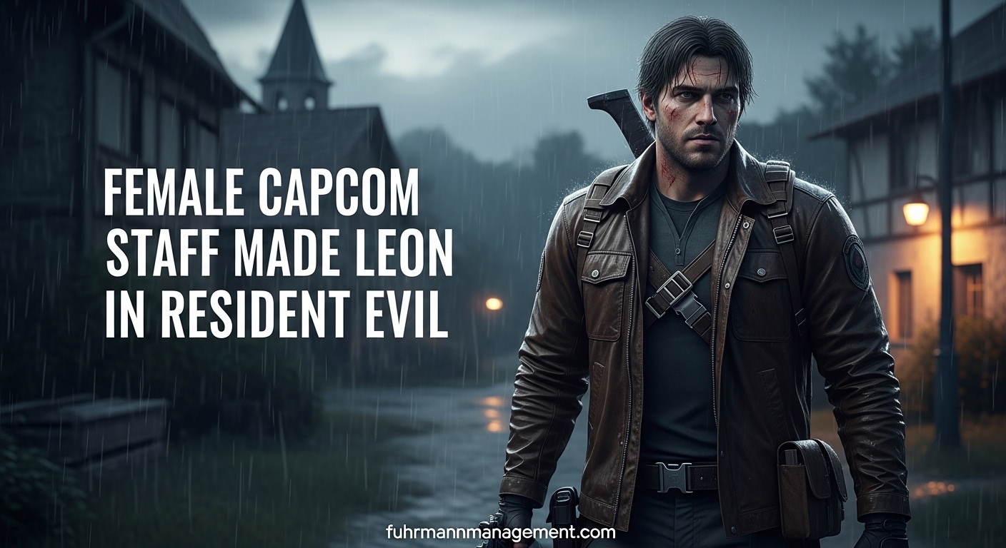
The original Leon’s “barnet” is legendary, but often memed for its ability to stay perfectly coiffed during a zombie apocalypse. The remake’s team, led by the input to maximize attractiveness, opted for a more natural, “swept-back” look. It’s tactical yet stylish, allowing for moments of messy vulnerability that fans adore. It frames his face better, highlighting his eyes and jawline—two focal points the design team evidently prioritized.
The Jacket and Fit
One of the most discussed changes was the removal of the heavy fur collar (which appeared in some early concept art for the remake) in favor of the classic, updated bomber jacket. The fit is everything here. In the remake, the jacket sits perfectly on his shoulders—broad enough to look imposing, but tailored enough to show he has an physique underneath. The female staff’s influence is visible in the choice to keep the jacket zipped just enough to hint at his build without looking like a tacticool cosplayer.
The “Raccoon City” Trauma
The team also utilized storytelling to enhance his attractiveness. The Leon in RE4 (Remake) is visibly tired. He has bags under his eyes. He’s seen things. This adds a layer of “sad boy” allure that resonates deeply with modern fandoms. It’s the difference between looking like a plastic doll and looking like a human being who needs a hug (and a shower).
The Mission to Make Leon Kennedy as Hot as Possible
It might sound trivial on paper, but having female Capcom staff on a mission to make Leon Kennedy as hot as possible represents a shift in the gaming industry. For years, female characters were designed with the male gaze in mind, often resulting in armor that defied physics. We are now seeing the rise of the “female gaze” in gaming, where male characters are subjected to the same level of aesthetic scrutiny.
This shift isn’t just about objectification; it’s about equity in fan service. Why shouldn’t the player controlling the protagonist get to look at someone incredibly handsome while they fight off bioterrorism? The Capcom team understood that Resident Evil 4 is an action-horror game, but it is also a power fantasy. Making Leon visually stunning enhances that fantasy for a massive portion of their player base.
Interestingly, this design philosophy aligns with broader trends in character management and user engagement. Just as effective management strategies require understanding the needs and desires of a team, effective character design requires understanding the desires of the audience. If you want to learn more about how creative teams align their visions with market desires, check out our article on /creative-team-management-strategies/.
Subtle Details: The “Husband Material” Factor
Beyond the big changes, the “mission” succeeded because of the micro-details. These are the things you might not notice immediately but that make Leon attractive on a subconscious level.
- The Hands: Capcom upgraded the hand models significantly. Whether he is holding a gun, reloading, or interacting with the environment, his hands are detailed and capable—a trait frequently cited in attraction psychology.
- The Voice and Grunts: While not strictly visual, the audio design works in tandem with the visuals. Leon’s exertion grunts during combat were rerecorded to sound less strained and more intense, adding to the physical appeal.
- The Stubble: The choice to give him designer stubble rather than a clean shave or a full beard was calculated. It suggests ruggedness and maturity that the original 21-year-old Leon lacked.
This attention to detail is what separates a good character model from a heartthrob. It is a testament to the dedication of the art team.
Fan Reaction and the “Thirst” Culture
The internet’s reaction to the new Leon was immediate and overwhelming. Social media platforms like Twitter (now X) and TikTok were flooded with appreciative posts, fan art, and edits. The hashtag #LeonKennedy trended for days upon the game’s release.
This reaction validates the risk Capcom took. By leaning into the attractiveness of the protagonist, they generated organic marketing that money can’t buy. Fans weren’t just talking about the gameplay mechanics or the horror elements; they were talking about how much they loved the main character. This buzz helps sustain the game’s longevity in the cultural conversation long after the credits roll.
Balancing Attraction with Horror
Of course, there is a fine line to walk. Resident Evil 4 is, first and foremost, a horror game. If Leon looked too polished, he would feel out of place in the dirty, bloody villages of rural Spain.
The genius of the design is that Leon can look undeniably handsome one moment, and then absolutely battered and traumatized the next. The “hotness” is versatile. It works in the calm, merchant-interaction moments and in the heat of battle against chainsaw-wielding maniacs. This duality is crucial for immersion. It reminds us of the importance of balancing aesthetics with functionality, a concept we explore further in our guide to /functional-vs-aesthetic-design-in-gaming/.
Conclusion
The revelation that female Capcom staff had a mission to make Leon Kennedy as hot as possible is one of the most refreshing behind-the-scenes stories in recent gaming history. It highlights a growing awareness of who plays games and what they want to see.
By taking a beloved character and refining him through a lens of modern appreciation—focusing on tactical realism mixed with undeniable charisma—the team created a version of Leon that will likely define the character for the next twenty years. It proves that when you prioritize diverse perspectives in character design, everyone wins. The game looks better, the fan engagement is higher, and the internet gets a new obsession. It’s a win-win scenario that other developers would be wise to replicate.